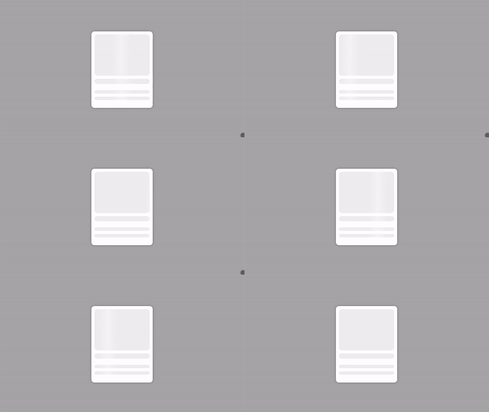
CSS Placeholder Animations

Ready to take your website's design to the next level? Dive into the world of CSS animations and learn how to create captivating placeholder animations that will captivate your audience and elevate their browsing experience.
Start by creating a basic HTML structure for your webpage. Define the placeholders for various elements such as images, titles, and text content within a container element.
<!DOCTYPE html>
<html lang="en">

<head>
  <meta charset="UTF-8">
  <meta name="viewport" content="width=device-width, initial-scale=1.0">
  <title>Create Beautiful Card Placeholders with CSS!</title>
</head>

<body>
  <div class="card">
    <div class="image-placeholder placeholder"></div>
    <div class="title-placeholder placeholder"></div>
    <div class="text-placeholder placeholder"></div>
    <div class="text-placeholder placeholder"></div>
  </div>
</body>

</html>
Copy and paste the provided CSS styles into your stylesheet. These styles define the appearance and animation of the placeholders, creating a visually appealing effect that engages users while content loads.
body {
  display: grid;
  background: #a5a5a5;
  min-height: 100vh;
  place-content: center;
}

.card {
  width: 20rem;
  aspect-ratio: 4 / 5;
  border-radius: 1rem;
  background: #fff;
  box-shadow: 0 0 12px rgba(0, 0, 0, 0.3);
  padding: 1rem;
  box-sizing: border-box;
}

.placeholder {
  background: #eee;
  border-radius: 1rem;
  position: relative;
  overflow: hidden;
}

.placeholder:after {
  content: '';
  position: absolute;
  top: 0;
  left: 0;
  bottom: 0;
  width: 100px;
  background: linear-gradient(90deg, #eee, #f4f4f4, #eee);
  animation: gradient 1s infinite ease-in-out;
}

.image-placeholder {
  aspect-ratio: 16 / 12;
  margin-bottom: 1rem;
}

.title-placeholder {
  aspect-ratio: 16 / 1.5;
  margin-bottom: 2rem;
}

.text-placeholder {
  aspect-ratio: 16 / 1;
  margin-top: 1rem;
  margin-bottom: 0;
}

@keyframes gradient {
  form {
    left: 0%;
  }

  to {
    left: 100%;
  }
}
Integrate the HTML and CSS code into your project, and you'll instantly enhance the user experience with dynamic placeholder animations. Experiment with different animation durations, gradients, and element ratios to customize the placeholders to match your website's design aesthetic.

With CSS placeholder animations, you can provide users with an engaging preview of content while improving perceived performance and creating a memorable browsing experience. Elevate your website's design and captivate your audience from the moment they land on your page. Let's get creative with placeholder animations today!
See the full video:
- CSS
- Front End Development
- Card Placeholders
- UI/UX
- CSS Animations
- Styling Tips