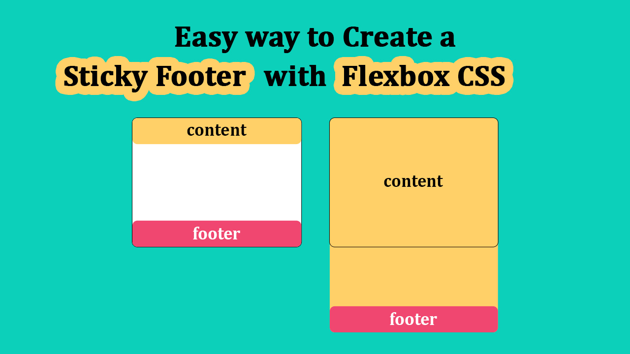
Sticky Footer with Flexbox CSS

How to Create a Sticky Footer with Flexbox CSS
Are you tired of struggling with sticky footers that just won't stay put? Say goodbye to your layout woes as we dive into an easy and elegant solution using Flexbox CSS.
<!DOCTYPE html>
<html lang="en">
<head>
  <meta charset="UTF-8">
  <meta name="viewport" content="width=device-width, initial-scale=1.0">
  <title>Easy Way to Create a Sticky Footer with Flexbox CSS</title>
</head>

<body>
  <div id="layoutMain">
    <div class="containerMain">
      <header id="header">Header</header>
      <div class="contentArea">Container Area</div>
    </div>
    <footer id="footer">Footer</footer>
  </div>
</body>
</html>
html,
body {
  width: 100%;
  height: 100%;
  margin: 0;
}

#layoutMain {
  width: 100%;
  height: 100%;
  display: flex;
  flex-direction: column;
}

.containerMain {
  flex: 1 0 auto;
}

footer#footer {
  flex-shrink: 0;
}
In the HTML structure, we have a basic layout with a header, a container area, and a footer. The CSS styling ensures that the footer sticks to the bottom of the page using Flexbox properties.

By separating the HTML and CSS sections, it becomes easier to understand and manage the code, making it more accessible for developers of all skill levels.
See the full video:
- CSS
- CSS3 Flexbox
- Front End Development
- Sticky Footer
- Footer Stay Bottom
- Flexbox Footer
- CSS Footer Sticky